Finding the perfect shade for your living room is about more than just picking a color you like; it is about defining the atmosphere of the place where you spend the majority of your life. Whether you are hosting a lively game night, curling up with a book, or unwinding after a long day at the office, your walls set the emotional stage for every interaction. In the world of interior design, color is the most transformative tool at your disposal, capable of making a cramped apartment feel like a sprawling loft or a cold, modern space feel like a cozy sanctuary. As we move into a new era of home aesthetics, the trends are shifting away from sterile, hospital-white minimalism toward hues that express personality, comfort, and a connection to the natural world.
The Power of Warm Neutrals and Earthy Tones
For years, cool greys dominated the Pinterest boards of every home renovator, but the tide has officially turned toward warmth. Warm neutrals like oatmeal, soft beige, and “greige” provide a sophisticated backdrop that feels much more inviting than the clinical blues of the past decade. These shades work beautifully because they reflect light without feeling harsh, creating a glow that persists even on cloudy days. When you choose an earthy neutral, you are creating a versatile canvas that allows your furniture to shine. A caramel-toned leather sofa or a reclaimed wood coffee table looks significantly richer against a backdrop of toasted almond than it ever would against a stark, flat white. These colors also bridge the gap between traditional and modern styles, making them a safe yet stylish bet for anyone looking to increase their home’s resale value while enjoying a cozy atmosphere.
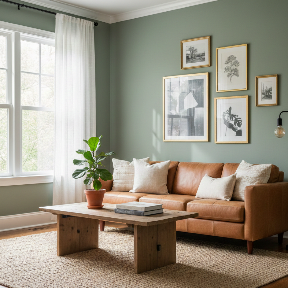
1. Sage Green: The New Neutral
Sage green has skyrocketed in popularity because it brings the outdoors in, acting as a breath of fresh air for windowless or dim living rooms. It is a color that feels both sophisticated and calming, mimicking the hushed tones of a forest floor. Because sage contains significant grey undertones, it doesn’t overwhelm the senses like a bright lime or emerald might. Instead, it serves as a muted, organic foundation that pairs exceptionally well with brass hardware, indoor plants, and cream-colored textiles. If you want your living room to feel like a spa-like retreat, a dusty sage is your best friend.
2. Terracotta and Muted Clay
For those who crave a bit more drama and warmth, terracotta and clay-based tones are making a massive comeback. These colors evoke the sun-drenched landscapes of the Mediterranean or the American Southwest. A muted terracotta adds an instant sense of history and “soul” to a room. It is a bold choice, but when paired with light oak flooring and ivory linen curtains, it feels grounded rather than overbearing. This palette is particularly effective in rooms that receive plenty of afternoon sunlight, as the orange and red pigments catch the light to create a fiery, cozy glow during the golden hour.
Moody and Atmospheric Deep Hues
There is a common misconception that dark colors make a room feel smaller. In reality, deep colors can actually make walls “disappear,” creating an illusion of infinite depth. If you have a small living room, painting it a dark, moody color can turn a cramped box into a sophisticated “jewel box” of a room. This approach is all about embracing the lack of light rather than fighting it.
3. Navy Blue and Midnight Charcoal
Navy blue is a timeless classic that offers a sense of stability and prestige. It is the interior design equivalent of a perfectly tailored suit. When applied to living room walls, it provides a stunning contrast for artwork and white architectural molding. If navy feels too traditional, consider a deep charcoal with a hint of blue or green. This “almost black” approach creates a high-contrast environment that makes colorful accents—like a mustard yellow velvet chair or a bright pink throw pillow—pop with incredible intensity.
4. Forest Green and Deep Teal
If you want a moody look that feels slightly more “organic,” forest green is the gold standard. It feels expensive, lush, and deeply comforting. Deep teal, on the other hand, offers a bit more vibrancy and works well in homes that lean toward a maximalist or eclectic style. Both colors excel at creating a sense of intimacy. When you paint a room in these shades, you are signaling that this is a space for deep conversation and relaxation. To keep the room from feeling too heavy, balance these dark walls with light-reflecting surfaces like mirrors, glass coffee tables, and metallic accents.
The Resurgence of “New” Whites and Pastels
White will never truly go out of style, but the way we use white is changing. We are seeing a move away from “Stark White” and toward “Gallery Whites” that have a drop of yellow or red in them to prevent a cold, blue cast. Similarly, pastels are growing up, moving away from “nursery” vibes and into sophisticated, “muddy” versions of classic colors.
5. Creamy Off-Whites and Vanillas
A true off-white can make a living room feel expansive and airy. The key is to look for “warm” whites that feel like heavy cream or parchment. These colors respond beautifully to artificial lighting, turning soft and golden in the evening under the glow of floor lamps. This is the ideal choice for a minimalist who still wants their home to feel “lived-in” and welcoming. It provides a clean slate for rotating seasonal decor, allowing you to change the entire look of your room just by swapping out pillows and rugs.
6. Dusty Rose and Mauve
Pink isn’t just for bedrooms anymore. A “grown-up” pink—often referred to as dusty rose or mauve—functions almost like a neutral. It has a unique ability to flatter skin tones, making everyone in the room look just a little bit better under the light. When paired with grey furniture or dark wood, a muted pink living room feels incredibly chic and modern. It’s a sophisticated way to add color without making the room feel like a “rainbow” space.
Tips for Choosing the Right Finish
Beyond the color itself, the “sheen” or finish of the paint plays a massive role in the final look. For living rooms, most designers recommend a Flat or Matte finish for the walls. These finishes do not reflect light, which helps hide imperfections in the drywall and gives the color a velvety, rich appearance. However, if you have children or pets, a Suede or Eggshell finish is a better choice. These have a very slight luster that makes the walls easier to wipe down without ruining the paint job. Always keep your trim (baseboards and window frames) in a Semi-Gloss or Satin finish in a slightly different shade (usually a cleaner white) to create a crisp, professional border for your chosen wall color.
Testing Your Colors: The Golden Rule
The biggest mistake you can make is choosing a paint color based solely on a small swatch in the hardware store. Lighting is the most important factor in how a color actually looks in your home. A color that looks like a beautiful sky blue in the store might look like a cold, icy grey in a north-facing room with little natural light.
- Sample large areas: Buy small sample cans and paint at least a two-foot square on different walls.
- Observe at different times: Check the color in the morning, afternoon, and at night under your actual light bulbs.
- The “Furniture Test”: Hold your existing fabric swatches or pillows against the painted sample to ensure they don’t “clash” or pull out weird undertones in the paint.
Comparison Table: Living Room Vibes vs. Colors
| Desired Vibe | Recommended Color Palette | Best For… |
| Cozy & Intimate | Terracotta, Chocolate Brown, Deep Plum | Large rooms that feel “empty” |
| Clean & Bright | Warm White, Pale Greige, Soft Linen | Small apartments with low light |
| Calm & Zen | Sage Green, Dusty Blue, Muted Teal | High-stress households |
| Bold & Sophisticated | Navy Blue, Charcoal, Emerald Green | Formal hosting and “Jewel Box” styles |
Choosing a living room paint color is a journey of self-expression. Don’t be afraid to take a risk; after all, it is just paint! If a bold navy blue feels right for your personality, embrace it. Your home should be a reflection of your unique taste, not just a carbon copy of a furniture catalog. By understanding the psychology of color and how it interacts with your specific space, you can create a living room that doesn’t just look good on Pinterest, but feels like home every single day.