Your bedroom is more than just a place to sleep; it is the physical manifestation of your mental state at the end of a long day. We often spend thousands of dollars on memory foam mattresses, high-thread-count Egyptian cotton sheets, and ergonomic pillows, yet we frequently overlook the most dominant visual element in the room: the color of the walls. The psychology of color suggests that the hues surrounding us can significantly influence our heart rate, blood pressure, and the production of melatonin. If you find yourself tossing and turning, the culprit might not be your caffeine intake or your screen time, but rather a wall color that is keeping your brain in a state of high alert. Transforming your bedroom into a true sleep sanctuary requires a strategic approach to color theory that balances personal aesthetics with biological needs.
The Science of Sleep and Color Psychology
To understand why certain colors work better than others, we have to look at how our eyes and brains process light. Within our retinas, there are specialized receptors called ganglion cells. These cells are particularly sensitive to blue and green wavelengths, which help regulate our circadian rhythms. When we see “active” colors, our brain suppresses melatonin, the hormone responsible for sleep. Conversely, “passive” colors signal to our nervous system that it is time to wind down. This is why a bright red or neon orange room might feel energetic during the day but can feel claustrophobic or overstimulating when you are trying to drift off. By selecting colors that fall on the cooler side of the spectrum or muted neutrals, you are essentially giving your brain a visual “off-switch.”
Blue: The Gold Standard for Rest
Study after study has shown that people with blue bedrooms tend to get more sleep than those with any other color. Blue is universally associated with calmness, the vastness of the sky, and the serenity of the ocean. It is a color that naturally lowers the heart rate and reduces blood pressure. However, not all blues are created equal. A bright, electric blue might be too stimulating for a sleep environment. Instead, look for shades like soft powder blue, navy with gray undertones, or a deep midnight blue. These shades provide a sense of security and stability. If you are worried about the room feeling too “cold,” you can balance a blue wall with warm wood furniture or brass accents to create a cozy, grounded atmosphere.
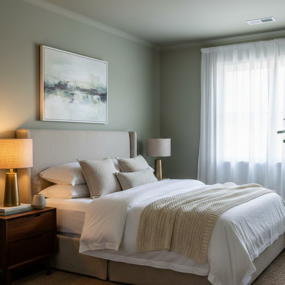
Sage Green: Bringing the Outdoors In
Green is often considered the most restful color for the human eye because it sits at the center of the color spectrum. It represents growth, renewal, and the natural world. In recent years, sage green and “eucalyptus” tones have become staples in interior design for their ability to create a biophilic connection. Because these colors are so prevalent in nature, they feel inherently safe to our primitive brains. A muted green with a hint of gray or brown prevents the room from feeling too “grassy” and instead creates a sophisticated, spa-like environment. Green is also incredibly versatile, pairing beautifully with linen textures and organic materials, which further enhances the “sanctuary” feel of the space.
The Power of Warm Neutrals and Earth Tones
If you prefer a more minimalist or timeless look, warm neutrals are your best friend. Pure white can often feel too clinical or stark, reflecting too much light and making it hard for the eyes to relax. Instead, opt for “greige”—a sophisticated mix of gray and beige—or soft terracotta and sand tones. These colors provide a warm embrace that feels like a physical hug. Earth tones are particularly effective because they feel permanent and solid. They don’t demand your attention; they simply provide a soft backdrop that allows your mind to wander and eventually settle. When using neutrals, the key to avoiding a “boring” room is to play with textures like chunky knit throws, velvet pillows, and woven rugs.
Why You Should Be Careful With Yellow and Red
While yellow is often associated with happiness and red with passion, they are generally the most difficult colors to manage in a bedroom. Yellow stimulates the nervous system and encourages wakefulness, which is great for a breakfast nook but terrible for a 2:00 AM wake-up call. Red is known to increase heart rate and even stimulate appetite. If you absolutely love these colors, consider using them as small accents—a single pillow or a piece of art—rather than painting all four walls. If you are determined to have a “warm” room, look toward the “dusty rose” or “terracotta” end of the spectrum, which provides the warmth of red without the aggressive physiological response.
Modern Trends: The Dark and Moody Bedroom
There is a growing trend toward “dusk-inspired” rooms featuring charcoal gray, deep forest green, or even matte black. While it might seem counterintuitive to paint a room a dark color, these shades can be incredibly effective for sleep. Dark colors absorb light rather than reflecting it, creating a cocoon-like effect that mimics the natural darkness of night. This is particularly beneficial for those who struggle with light sensitivity or work night shifts and need to sleep during the day. A dark bedroom feels intimate and luxurious, especially when paired with soft, ambient lighting like warm-toned LED strips or bedside lamps with Edison bulbs.
Practical Tips for Testing Colors
Before you commit to a gallon of paint, it is crucial to test your choices in the actual environment. Light changes drastically throughout the day. A color that looks like a beautiful soft gray in the morning light might turn into a muddy purple by sunset. Use large adhesive paint swatches and place them on different walls. Observe how they look under your bedroom’s specific lighting—both natural and artificial. Remember that the finish of the paint matters too; a “flat” or “matte” finish is generally better for bedrooms as it hides wall imperfections and diffuses light more softly than a “satin” or “eggshell” finish.
Creating a Cohesive Sleep Environment
Choosing the wall color is just the first step. To truly enhance your sleep sanctuary, you must consider how that color interacts with the rest of your decor. Your bedding should ideally complement or contrast gently with your walls. For example, if you have deep navy walls, crisp white or light gray bedding can provide a refreshing visual break. If you have sage green walls, oatmeal-colored linens will enhance the natural vibe. Don’t forget the ceiling; many designers recommend painting the ceiling a slightly lighter shade of the wall color to create a seamless, infinite feel that makes the room seem taller and more expansive.
Final Thoughts on Your Color Journey
Ultimately, the best color for your bedroom is one that makes you feel a sense of immediate relief when you walk through the door. While science points toward blues and greens, personal preference and emotional connection to a color are just as important. Your bedroom is the most private space in your home—it is the one place where you don’t have to perform for anyone else. By choosing a palette that prioritizes peace over “pop,” you are making a long-term investment in your health and well-being. A well-chosen color doesn’t just decorate a room; it sets the stage for the rest and recovery your body deserves.